|
|
| |

Chart 3.1 Income Distribution in Three Countries for Percentage of Households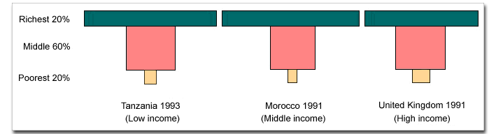
The trend across all countries is for the richest 20% of the population to earn incomes that are many times higher than the poorest 20%, despite large differences in the GNP per capita of high-, middle-, and low-income countries. To see the actual differences in average income for the richest, middle, and poorest segments of these countries, look at Chart 3.2. |
Explore the Chart 3 Exercises: Work on line | Print version | Print version with answers
| Copyright
© 2000 IBRD/The World Bank |
dep@worldbank.org |